Analysing and predicting customer churn using Pandas, Scikit-Learn and Seaborn
TweetAs the title describes this blog-post will analyse customer churn behaviour. The customer churn-rate describes the rate at which customers leave a business/service/product. For a lot of organisations this is a very important metric or behaviour to model and understand as it is often more expensive to obtain new customers than to keep existing customers on board. Therefore it is worthwhile predicting which customers may want to leave and try to keep them on-board as customers.
For this occasion we’ll use a commonly used and freely available telecoms churn dataset. All data and code used in this post are available in the github-repository.
Telecoms churn dataset
Lets load in the data and get a feel for what we actually have to deal with. For this we use the Pandas function read_csv that allows us to load data directly from a *.csv file.
import pandas as pd
import numpy as np

churn_df = pd.read_csv('../data/telecom-churn.csv')
We have our data but don’t yet know what it looks like. The first thing that may prove useful is to see how large the dimensions of the dataset are. Once we know how many samples (i.e., rows) and features (i.e., columns) we have available we can start thinking of how to proceed. To look at the size of the dataset we can use shape on a Pandas DataFrame.
print 'DataFrame size: {}'.format(churn_df.shape)
DataFrame size: (3333, 21)
So we have 3333 samples of data each containing 21 features. However, we don’t know yet what kind of features/columns we are dealing with. Lets take a look at what the column names are to see what we are really dealing with.
colNames = churn_df.columns.tolist()

print '\nNumber of columns available: {}'.format(len(colNames))
print '\nColumn names: {}\n'.format(colNames)
Number of columns available: 21

Column names: ['State', 'Account Length', 'Area Code', 'Phone', "Int'l Plan", 'VMail Plan',
'VMail Message', 'Day Mins', 'Day Calls', 'Day Charge', 'Eve Mins', 'Eve Calls', 'Eve Charge',
'Night Mins', 'Night Calls', 'Night Charge', 'Intl Mins', 'Intl Calls', 'Intl Charge',
'CustServ Calls', 'Churn?']
What we are dealing with is a lot of information on accountholders and their phone-plans. We can, for example, see how many minutes they use, how many calls they make and if they frequently contacted customer service.
From the looks of it we will first need to do a little bit of cleanup. The column names have either spaces or apostrophes in them which makes it a little harder later on the directly access them. We’ll just rename all those columns now and then start looking at the actual data we have at hand. In this case I will manually rename the column names but if your dataset would contain hundreds of columns you probably would want to write a function for this. To rename columns we can make use of the function rename that can be applied to Pandas DataFrames.
churn_df.rename(
    columns={
        "Account Length":"AccountLength",
        "Area Code":"AreaCode",
        "Int'l Plan":"IntlPlan",
        "VMail Plan":"VMPlan",
        "VMail Message":"VMMessage",
        "Day Mins":"DayMins",
        "Day Calls":"DayCalls",
        "Day Charge":"DayCharge",
        "Eve Mins":"EveMins",
        "Eve Calls":"EveCalls",
        "Eve Charge":"EveCharge",
        "Night Mins":"NightMins",
        "Night Calls":"NightCalls",
        "Night Charge":"NightCharge",
        "Intl Mins":"IntlMins",
        "Intl Calls":"IntlCalls",
        "Intl Charge":"IntlCharge",
        "CustServ Calls":"CustServCalls",
        "Churn?":"Churn"
    },inplace=True
)

print 'Column names: {}'.format(churn_df.columns.tolist())
Column names: ['State', 'AccountLength', 'AreaCode', 'Phone', 'IntlPlan', 'VMPlan',
'VMMessage', 'DayMins', 'DayCalls', 'DayCharge', 'EveMins', 'EveCalls', 'EveCharge',
'NightMins', 'NightCalls', 'NightCharge', 'IntlMins', 'IntlCalls', 'IntlCharge',
'CustServCalls', 'Churn']
That is much better! Removing the spaces will make it considerably easier later on to access columns.
Now that we have an idea of what kind of data we are dealing with, but we have not actually seen how the data is formatted. To get some very quick and basic insight in the values in each of the column we can use the head or tail functions on a Pandas DataFrame. They allow us to see the first or last few rows of the DataFrame.
print churn_df.head(3)
  State  AccountLength  AreaCode     Phone IntlPlan VMPlan  VMMessage  \
0    KS            128       415  382-4657       no    yes         25
1    OH            107       415  371-7191       no    yes         26
2    NJ            137       415  358-1921       no     no          0

   DayMins  DayCalls  DayCharge   ...    EveCalls  EveCharge  NightMins  \
0    265.1       110      45.07   ...          99      16.78      244.7
1    161.6       123      27.47   ...         103      16.62      254.4
2    243.4       114      41.38   ...         110      10.30      162.6

   NightCalls  NightCharge  IntlMins  IntlCalls  IntlCharge  CustServCalls  \
0          91        11.01      10.0          3        2.70              1
1         103        11.45      13.7          3        3.70              1
2         104         7.32      12.2          5        3.29              0

    Churn
0  False.
1  False.
2  False.

[3 rows x 21 columns]
That looks great. However, there is somewhat of a mix of different types of data. The State, IntlPlan, VMailPlan and Churn columns all contain text whereas the other columns have numerical values. We’ll forget about the State column for a second because that one contains a lot of different values (most likely each state in US will be represented in the dataset).
Lets first deal with three columns in particular: the IntlPlan, VMailPlan and Churn columns. In the first two cases it most likely just contains the values no and yes and in the churn-case it most likely only contains true and false.
To very quickly check this lets look at the counts for all of the columns values:
print '\n', churn_df.IntlPlan.value_counts()
print '\n', churn_df.VMPlan.value_counts()
print '\n', churn_df.Churn.value_counts()
no     3010
yes     323
Name: IntlPlan, dtype: int64

no     2411
yes     922
Name: VMPlan, dtype: int64

False.    2850
True.      483
Name: Churn, dtype: int64
Those columns are indeed made up out of only two text-values. We can now change these text-values to numbers so that we can actually work with them in calculations. Because we are dealing with no/yes and false/true we can simply replace them by 0/1 values.
churn_df.IntlPlan = churn_df.IntlPlan.apply( lambda x: 1.0 * (x=='yes') )
print '\n', churn_df.IntlPlan.value_counts()

churn_df.VMPlan = churn_df.VMPlan.apply( lambda x: 1.0 * (x=='yes') )
print '\n', churn_df.VMPlan.value_counts()

churn_df.Churn = churn_df.Churn.apply( lambda x: 1.0 * (x=='True.') )
print '\n', churn_df.Churn.value_counts()
0    3010
1     323
Name: IntlPlan, dtype: int64

0    2411
1     922
Name: VMPlan, dtype: int64

0    2850
1     483
Name: Churn, dtype: int64
That helps! We now only have to deal with numbers, apart from the State, but we’ll get to that later.
Exploratory Data Analysis (EDA)
Our data is now ready. We can of course start our analysis straightaway and build a model to predict the churn rate, but we would be doing that without any insight or feel for what data is like. Before diving into the analysis part we should therefore start by exploring the actual data to see what we can find out from just looking at it.
A great way to start is by simply looking at what kind of ranges each feature has and how much they vary around their average values. To quickly get this information we can use the describe function on a Pandas DataFrame.
print churn_df.describe()
       AccountLength     AreaCode     IntlPlan       VMPlan    VMMessage  \
count    3333.000000  3333.000000  3333.000000  3333.000000  3333.000000
mean      101.064806   437.182418     0.096910     0.276628     8.099010
std        39.822106    42.371290     0.295879     0.447398    13.688365
min         1.000000   408.000000     0.000000     0.000000     0.000000
25%        74.000000   408.000000     0.000000     0.000000     0.000000
50%       101.000000   415.000000     0.000000     0.000000     0.000000
75%       127.000000   510.000000     0.000000     1.000000    20.000000
max       243.000000   510.000000     1.000000     1.000000    51.000000

           DayMins     DayCalls    DayCharge      EveMins     EveCalls  \
count  3333.000000  3333.000000  3333.000000  3333.000000  3333.000000
mean    179.775098   100.435644    30.562307   200.980348   100.114311
std      54.467389    20.069084     9.259435    50.713844    19.922625
min       0.000000     0.000000     0.000000     0.000000     0.000000
25%     143.700000    87.000000    24.430000   166.600000    87.000000
50%     179.400000   101.000000    30.500000   201.400000   100.000000
75%     216.400000   114.000000    36.790000   235.300000   114.000000
max     350.800000   165.000000    59.640000   363.700000   170.000000

         EveCharge    NightMins   NightCalls  NightCharge     IntlMins  \
count  3333.000000  3333.000000  3333.000000  3333.000000  3333.000000
mean     17.083540   200.872037   100.107711     9.039325    10.237294
std       4.310668    50.573847    19.568609     2.275873     2.791840
min       0.000000    23.200000    33.000000     1.040000     0.000000
25%      14.160000   167.000000    87.000000     7.520000     8.500000
50%      17.120000   201.200000   100.000000     9.050000    10.300000
75%      20.000000   235.300000   113.000000    10.590000    12.100000
max      30.910000   395.000000   175.000000    17.770000    20.000000

         IntlCalls   IntlCharge  CustServCalls        Churn
count  3333.000000  3333.000000    3333.000000  3333.000000
mean      4.479448     2.764581       1.562856     0.144914
std       2.461214     0.753773       1.315491     0.352067
min       0.000000     0.000000       0.000000     0.000000
25%       3.000000     2.300000       1.000000     0.000000
50%       4.000000     2.780000       1.000000     0.000000
75%       6.000000     3.270000       2.000000     0.000000
max      20.000000     5.400000       9.000000     1.000000
This immediately gives us some information about the average churn rate in the dataset. We can see that, on average, 14.4% of the users churns.
The interesting thing would be to see how this information changes when you split it out for other features that we have available. For example, do people with an International Plan (IntlPlan) have a higher average churn than without? To get these insights we will use two functions. The first one is a function named crosstab that you can use within Pandas to count the number of instances or samples based on two dimensions. So in this case we want to see how many people have an international plan and how many churn.
print pd.crosstab(churn_df.IntlPlan, churn_df.Churn)
Churn        0    1
IntlPlan
0         2664  346
1          186  137
This gives some information, but it is not incredibly useful. A more useful function we can use is the groupby function on a Pandas DataFrame. This allows us to group the data by one features values and then perform functions on another feature. Lets say that we want to see how many people have and do not have an international plan, how many of those people churn and what therefore the average churn rate is for both sections.
print 'Number of users in each section: \n{}'.format(churn_df[['Churn','IntlPlan']].groupby('IntlPlan').count())
print '\nNumber of users that churn in each section: \n{}'.format(churn_df[['Churn','IntlPlan']].groupby('IntlPlan').sum())
print '\nAverage churn rate in each section: \n{}'.format(churn_df[['Churn','IntlPlan']].groupby('IntlPlan').mean())

# To do this on all columns you can use:
# print churn_df.groupby('IntlPlan').mean()
Number of users in each section:
          Churn
IntlPlan
0          3010
1           323

Number of users that churn in each section:
          Churn
IntlPlan
0           346
1           137

Average churn rate in each section:
             Churn
IntlPlan
0         0.114950
1         0.424149
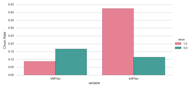
This is great insight. We can immediately see there is a clear difference in the average churn rate between people with and without an international plan (42.4% versus 11.5%).
Another way of getting this insight in a more structured format is by using a Pivot Table. Pivot tables are very common and frequently used in spreadsheet programs like Excel. We can create the same type of overview table using the Pandas function pivot_table. You need to specify what values you want to calculate your functions on and what your dimensions are to split the data on. To get some more insight we will now create a pivot table for both the features IntlPlan and VMPlan.
print '\n', pd.pivot_table(churn_df, values='Churn', index=['IntlPlan'], aggfunc=[len,np.sum,np.mean])
print '\n', pd.pivot_table(churn_df, values='Churn', index=['VMPlan'], aggfunc=[len,np.sum,np.mean])
           len  sum      mean
IntlPlan
0         3010  346  0.114950
1          323  137  0.424149

         len  sum      mean
VMPlan
0       2411  403  0.167151
1        922   80  0.086768
More interesting insights here! We had already noted that people with an international plan had a higher average churn rate, but we can now see it is the opposite for people with a voicemail plan. So from just looking at the number and some counting and dividing we can already get some basic but interesting insights.
Exploratory Data Analysis (EDA) using Visualisation
We already obtained some great insights by looking at the data itself, slicing it and looking at descriptive statistics such as average churn rates for various data categories. A more intuitive and engaging way to get insight into the data is by visualisation. Pandas has some great visualisation functionality built in but we’ll also use a great library for more statistical visualisations in python: Seaborn.
For a great description of some of the functionalities in Seaborn I recommend the blog-post from InsightDataLabs: Data Visualization in Python: Advanced Functionality in Seaborn
%matplotlib inline
import matplotlib.pyplot as plt

import seaborn as sns
sns.set(style="whitegrid")
Before we looked at how the average churn rate differed for people with and without a voicemail plan or an international plan. The pivot-tables were incredibly useful, but it would be great if we could visually display the same results. The most straightforward way of doing this may be by plotting barcharts for the average churn-rate in each of the variables.
# Create a new temporary dataframe to help us plot these variables.
df1 = pd.melt(churn_df, id_vars=['Churn'], value_vars=["VMPlan","IntlPlan"], var_name='variable' )

# Create a factorplot
g = sns.factorplot( x="variable", y="Churn", hue='value', data=df1, size=4, aspect=2, kind="bar", palette="husl", ci=None )
g.despine(left=True)
g.set_ylabels("Churn Rate")
plt.show()
Most features have a wider range of numbers, not just 0 or 1. So for those it makes sense to look at how the distribution of the data differs for the people that churn and the people that don’t churn. We can do this in two ways.
Firstly if a variable has a small number of different values/categories we could create a similar bar-chart (factorplot) for each of those values representing the average churn-rate for that specific value. We’ll try this for the CustServCalls variable which had a range from 0 to 9.
df2 = pd.pivot_table(churn_df, values='Churn', index=['CustServCalls'], aggfunc=[len,np.sum,np.mean])
df2['ix'] = df2.index.values
print df2
                len  sum      mean  ix
CustServCalls
0               697   92  0.131994   0
1              1181  122  0.103302   1
2               759   87  0.114625   2
3               429   44  0.102564   3
4               166   76  0.457831   4
5                66   40  0.606061   5
6                22   14  0.636364   6
7                 9    5  0.555556   7
8                 2    1  0.500000   8
9                 2    2  1.000000   9
Obviously this is more easily interpreted in a visual way. We’ll use the barplot for this.
sns.barplot(x="ix", y="mean", data=df2, palette="Blues_d", saturation=.5)
plt.show()
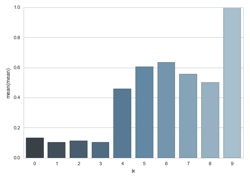
This is some interesting insight: people who call more often to customer service also churn way more: interesting, but not surprising.
So this method seems to work well when a feature may have a limited range of values and when those values are also quite discrete. When dealing with larger ranges and more continuous features these graphs will quickly become less informative. This is where it makes more sense to look at the distribution or kernel-density of a variable. For these visualisations we will use the violinplot from the seaborn library.
plt.figure(figsize=(16, 12))

for e, column in enumerate(['DayMins','DayCharge','DayCalls',
                            'EveMins','EveCharge','EveCalls',
                            'NightMins','NightCharge','NightCalls']):
    plt.subplot(4, 3, e + 1)
    sns.violinplot( data=churn_df, x='Churn', y=column, palette="husl")
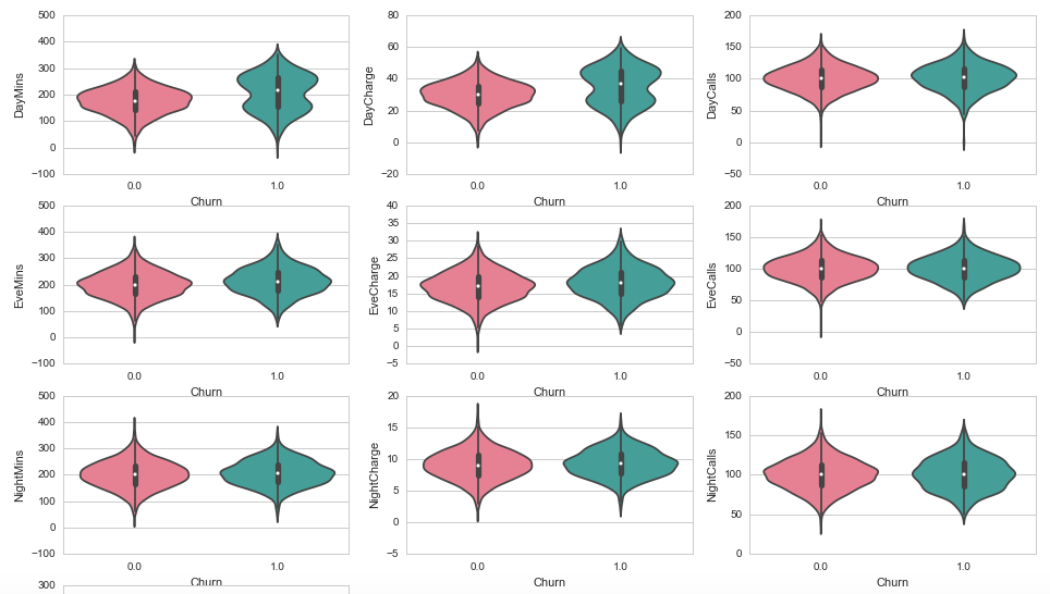
From these graphs the most interesting ones may be the DayMins and DayCharge. Obviously these two will be related since the charge is most likely determined by the minutes used and some tariff. From the above graphs it is interesting to note that they seem to have a bimodal distribution with a higher maximum. This may indicate that very active users are more likely to churn, perhaps because they are always looking for a better package/deal or because they are more affected by poor service or not meeting their expectations.
External Data
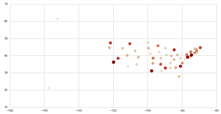
One way to deal with the state variable that we have now is to try and convert it to a geographical value. Luckily the web comes to the rescue and I found a list with the average latitudes and longitudes for each US State. A bit rough, but it is just for the sake of the exercise.
df_state = pd.read_csv('churn---state-latlon.csv')
print df_state.head(2)
  state  latitude  longitude
0    AK    61.385  -152.2683
1    AL    32.799   -86.8073
Great, we can now merge this data into the DataFrame we were working with using the merge function. This will duplicate the state column, so we can drop that one as well.
churn_df = churn_df.merge(df_state,left_on='State',right_on='state')
churn_df.drop('state', axis=1, inplace=True)
print churn_df.head(2)
   AccountLength  AreaCode     Phone  IntlPlan  VMPlan  VMMessage  DayMins  \
0            128       415  382-4657         0       1         25    265.1
1             70       408  411-4582         0       0          0    232.1

   DayCalls  DayCharge  EveMins    ...      NightMins  NightCalls  \
0       110      45.07    197.4    ...          244.7          91
1       122      39.46    292.3    ...          201.2         112

   NightCharge  IntlMins  IntlCalls  IntlCharge  CustServCalls  Churn  \
0        11.01        10          3         2.7              1      0
1         9.05         0          0         0.0              3      0

   latitude  longitude
0   38.5111   -96.8005
1   38.5111   -96.8005

[2 rows x 22 columns]
…
plt.figure(figsize=(12,6))
plt.scatter(
    x=df_state_merged.longitude,
    y=df_state_merged.latitude,
    s=df_state_merged['mean']*20**2,
    c=df_state_merged['mean'],
    cmap=plt.get_cmap('OrRd')
)
pass
Preprocessing and Feature Engineering
One of the most important stages in data analysis is probably the pre-processing and feature engineering stage. At this stage you will consider how you can use existing information to extract important features for prediction. This is often considered more of an art than a science and it usually requires some good understanding of the data, the domain/industry and the problem:
Coming up with features is difficult, time-consuming, requires expert knowledge. “Applied machine learning” is basically feature engineering. — Andrew Ng
Pre-processing essentially focuses on two problems: (1) data quality and (2) data representation. The first focuses on the quality of your dataset and potential problems with errors in the data itself. This often results in discarding data or adding values based on imputation or interpolation. The second issue deals with the question of how you transform your data such that it will work best with your algorithms.
churn_df.drop('Phone', axis=1, inplace=True)
When looking at all the other features we have three different features around the usage per part of the day (day, eve, night). We know how many minutes people have used their phone, how many calls they have made and how much they were charged for that activity. The interesting part is that two of those variables seem to depend on an other one of the variables.
- You can argue that the number of minutes if most likely related to the number of calls made. Calls say something about activity, but the minutes per call also give an indication about activity. So I decided to create a new variable that has the average minutes called per call.
- The charge is most likely a function of the number of minutes and some tariff applied to that. So it makes sense to create a feature that represents the tariff people were charged on.
churn_df['DayMinsPerCall'] = churn_df['DayMins'] / churn_df['DayCalls']
churn_df['EveMinsPerCall'] = churn_df['EveMins'] / churn_df['EveCalls']
churn_df['NightMinsPerCall'] = churn_df['NightMins'] / churn_df['NightCalls']
churn_df['DayPricePerMin'] = churn_df['DayCharge'] / churn_df['DayMins']
churn_df['EvePricePerMin'] = churn_df['EveCharge'] / churn_df['EveMins']
churn_df['NightPricePerMin'] = churn_df['NightCharge'] / churn_df['NightMins']
This code will nicely generate the new features, but it will also insert NaN’s due to dividing by zero. To deal with this we have to make sure to set all of the NaN values to zero.
for col in ['DayMinsPerCall','EveMinsPerCall','NightMinsPerCall','DayPricePerMin','EvePricePerMin','NightPricePerMin']:
    print col, churn_df[col].isnull().sum()
    churn_df.loc[churn_df[col].isnull(),col] = 0
DayMinsPerCall 2
EveMinsPerCall 1
NightMinsPerCall 0
DayPricePerMin 2
EvePricePerMin 1
NightPricePerMin 0
We have an existing variable that has the number of voicemail messages. Since it also contains the number 0 for some samples it can be hard for some algorithms to assign any importance to that as it would be multiplying with a 0. It can be wise to create a new variable that tells us if the number of voicemail messages is equal to zero. We’ll label this variable NoVMMessages and it will have a value of 1 if there are no voicemail messages and 0 otherwise.
churn_df['NoVMMessages'] = churn_df['VMMessage'].apply( lambda x: 1.0*(x<1) )
Because we have the latitude and longitude for each state now we can also drop the column that has the state code.
churn_df.drop('State', axis=1, inplace=True)
We now have all the variables we need to work with. To make it easier to use in some models later on we’ll now convert the Pandas DataFrame to a Numpy matrix. We’ll create a vector y holding the churn-labels and a matrix X with all the explanatory variables.
y = churn_df.Churn.values

churn_df.drop('Churn', axis=1, inplace=True)

X = churn_df.values
This gives us a matrix to work with. The big problem now is that a lot of the values are in completely different ranges. Remember that features like NoVMMessages are 0 or 1 whereas a feature like IntlMins ranges from 0 to a value in the hundreds. Such differences in ranges for different features may cause problems in some models. Models that depend on calculating some distance between samples can be thrown off by the scaling of the individual features. To account for this we are going to rescale all features and standardize them. This boils down to subtracting their invidual means and dividing by the individual standard deviations.
For this we can use the Scikit-Learn library and its StandardScaler function. The documentation for this function re-iterates the previous point stating that:
Standardization of a dataset is a common requirement for many machine learning estimators: they might behave badly if the individual feature do not more or less look like standard normally distributed data (e.g. Gaussian with 0 mean and unit variance).
from sklearn.preprocessing import StandardScaler

scaler = StandardScaler()

X = scaler.fit_transform(X)
Cross-Validation
Before trying to predict the customer churn using any models we need to give our cross-validation framework some thought. Cross-validation is defined by Wikipedia as
a model validation technique for assessing how the results of a statistical analysis will generalize to an independent data set.
It serves the purpose of testing how well the model performs on data it has not seen before. It is a great way to get a feel for (a) how much overfitting is going on in the training of the model and (b) how robust the model is when facing uncertainty in terms of new data it encounters.
One way to approach cross-validation is by cutting up the dataset into a number of chunks (also known as folds). You then take the first chunk and keep it on the side. You take all the remaining data and train your model using that data. You then use your trained model to predict the chunk that you initially kept out and on the side. These predictions will give you a feel for how well your model can deal with that chunk of data that is has not seen before. Now repeat this process for each chunk that you have available and at the end you will have predictions for each datapoint in your dataset.
There are a number of different techniques for cross-validation and each problem will probably justify its own cross-validation procedure. To not overcomplicate things we’ll stick with a very basic approach here that splits the dataset up in a number of blocks. Scikit-Learn has a great toolkit for cross-validation that we can draw from.
from sklearn.cross_validation import KFold

def cvTrainPredict(X,y,classifier):
    # Create an array of zeros for our predicted probabilities of churning.
    y_pred = np.zeros((len(y),1))
    y_prob = np.zeros((len(y),1))
    # Get the k-fold cross validations
    kf = KFold(len(y),n_folds=3,shuffle=True)
    # For each of the k-folds that we have just created.
    for trainIx, cvIx in kf:
        X_train, X_cv = X[trainIx], X[cvIx]
        y_train = y[trainIx]
        classifier.fit(X_train,y_train)
        # Predict class and probabilities
        y_pred[cvIx] = classifier.predict(X_cv).reshape((-1,1))
        y_prob[cvIx] = classifier.predict_proba(X_cv)[:,1].reshape((-1,1))
    return (y_pred,y_prob)
We now have our cross-validation framework. This will, once given the data and a classifier, predict for each user if they are going to churn and the probability that classification is based on. One thing we now need to take into account is how we know if we did well. So how do we measure the performance of our model?
Performance
We could simply calculate how many of the predicted users we have predicted correctly: the accuracy. We could also look at how many of the actual churners we have correctly predicted as those are the customers that we don’t want to loose! This measure is usually referred to as the recall of the model. Here again Scikit-Learn has a range of the performance metrics built-in.
from sklearn.metrics import accuracy_score, recall_score, confusion_matrix
Predicting: Random Forest Classifier
For our predictive model we will use the Scikit-Learn implementation of a Random Forest Classifier. This models gives us some parameters we can use to increase the size and depth of the model. What we need to do next is use the cross-validation framework we built previously and give it the data and model of our choice.
from sklearn.ensemble import RandomForestClassifier

y_pred, y_prob = cvTrainPredict(X,y,RandomForestClassifier(n_estimators=50,max_depth=9))

print 'Accuracy: {}%'.format(100.0 * accuracy_score(y,y_pred))
print 'Recall:   {}%'.format(100.0 * recall_score(y,y_pred))

sns.heatmap(confusion_matrix(y,y_pred,labels=[0,1]), annot=True, fmt="d", linewidths=.5)
plt.ylabel('True label')
plt.xlabel('Predicted label')
pass
Accuracy: 94.2094209421%
Recall:   63.5610766046%
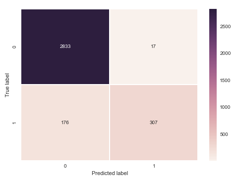
This is already a great result. It accurately predicts 94.2% of all customers! However, most of those are not churning and are therefore less interesting. If we look at the confusion-matrix that we created of the predictions versus the actual results we can see that we only correctly pick out 307 churning customers, but fail to identify the other 176 customers who do churn as well. This is correctly represented by the recall metric, which shows us we are only 63.56% good on the customers we actually want to be most accurate on.
Lets take a look and see how the model performs if we increase the number of estimators (the size) of the model.
y_pred, y_prob = cvTrainPredict(X,y,RandomForestClassifier(n_estimators=200,max_depth=9))

print 'Accuracy: {}%'.format(100.0 * accuracy_score(y,y_pred))
print 'Recall:   {}%'.format(100.0 * recall_score(y,y_pred))

sns.heatmap(confusion_matrix(y,y_pred,labels=[0,1]), annot=True, fmt="d", linewidths=.5)
plt.ylabel('True label')
plt.xlabel('Predicted label')
pass
Accuracy: 94.3894389439%
Recall:   64.8033126294%
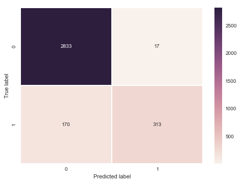
Bigger model, similar results.
Plenty of other interesting things to look at: Precision/recall graphs, AUC, Other models (e.g., SVM, KNN), Feature importance.